Wednesday, February 25, 2009

Jennifer Cooper

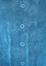
Cloth received Jan 7, two anxious weeks later than expected, but finally here.  Love the colour, but don’t want to get too attached to it, as that isn’t going to last long.  Pinned it to my design wall, notice my weight bench upright blocking view?

Decided to wait a bit before diving in, and “listen” to the cloth.  Did some research on Mixing Blue 402c, and learned it should discharge to a grey.  This should be good. I did a test, and it discharged completely, to a wonderful white.  You definitely knew what you were doing when you pre dyed our pieces with this Mixing Blue.  Fantastic – got to get me some of this stuff from Pro Chem.  Knowing it will go white, anything could happen.

 After a week of listing possibilities and ideas, and generally procrastinating … I decide to let the elastic band marks guide my start.  I also decide that I want to respect the original blue in some way, so must enable some of it to shine through.  Using my husband’s glass marble collection, and some old golf balls of my dad’s … I elastic band wrap lots in a zig zagging swirl down the middle area, and then position 4 golf balls in outer edge areas.  186 marbles, 4 golf balls …Then a quick discharge bath in thiox, and ….

Now what?  Cloth started blue, so I figured complementary oranges might be a nice place to start.  Listen to the cloth.

I arranged the white bound silk in the largest plastic tray I could find in our basement.  Lucky for me, I already owned something big enough to lay 2 m of cloth into. Next step was going to be tray dyeing, using some basic primary MX:  Pro Chem Golden Yellow 104, and Pro Chem Mixing Red 305.  Used 1 tsp powder dye in 1 c of water, to make a simple concentrate solution. 

Blue outlines I had expected, but the blending of golds, oranges to reds, ended up being much stronger and brighter than I had expected.  On cotton, these basic primaries are much more toned and less in your face.  What did I expect?  Silk is not cotton.

 Lots of possibilities to overdye, add more bound shapes? Decided to use some even smaller glass beads to elastic bind into areas.  To widen and thicken the curves of the zig zag.  Elastic bound these.  Then, soda soaked the cloth in 9 T soda ash, plus 1 gal water.  20 minutes.  Squeezed out excess.  Arranged back into the large tray.  Only wanted to drip drop various dyes over top of the new bound beads, and some over the edge red areas.  Used 1 tsp Pro Chem ProIntense Blue 406, in 1 c water.  Dripped and eye dropper dropped.  Covered tray, batched overnight.  Rinsed well.Hmm … got the little squares and some nice soft blue in the original squares.  But the red didn’t soften as I had hoped. 

Asked a few dyer friends about silk and dye saturation points … none really had experienced this.  Hmm … maybe it’s the soda soaking?  I really want to darken those edges.  So … against the odds, I re tried the soda soaking, using a 3 T Maiwa Brown in ½ c water concentrate.  This was a super dark concentrate.  Tray dyed again, and poured and spooned concentrate directly over areas I wanted darker.  Batched 8 hours.  Was looking great in the tray.  Rinsed.  Oh no….. most of the beautiful darkness washed down the drain.  Cloth had darkened a bit, but not like it should have.  Boo hoo. Well, now what? Looks as though using dye was out of the question.  Would need to start using fabric paints.  

Maybe potato dextrin texturing might be interesting.  That way I could paint in dark Setacolour into the crackles, and darken in a subtle manner.  Never tried potato dextrin before, but was willing to try it to get those wonderful organic crackles.  Just happened to have a bag in the cupboard.  It’s surprising what one accumulates over time. I forged ahead with the application. It dried with great cracking and veins.  Sure hope this works – had to wait 2 days for it all to dry on the dining room table.  Once dry, I even crumbled everything up and made even more cracks into cloth surface by squeezing it all up tightly.  Had just received the latest Quilting Arts issue, and couldn’t believe it when I saw your article about flour mixtures over cloth.  As I waited for my “potatoes” to dry, I marveled how coincidental the timing of your article seemed.

 Hard to believe that with all that dark paint, only these light cracks showed through.  Now how am I going to darken areas I want darker?

Guess I’ll have to resort to printing or screening.  I’m not very skilled at either, and seem to make blobs in unwanted spots, but what choice do I have?  Made up some potential thermofax screen images – photocopies of elastic bound marbles, done in soft swirls and curves.  Looked OK, crisp copies.  Oh Oh, tattoo shop closed – staff gone on holidays.  They’re the only shop nearby with a thermofax machine.   I’m just going to make stamps and print areas darker.

Once cloth dry, I brushed Opaque Setacolour firmly and harshly into the cracks and over dextrin surface.  A mix of Raw Sienna and Black – a great dark brown.  This better work.  Edges were now very dark brown.  Let it rest 24 hours, as I was now running out of time to finish this whole challenge.  Soaked, rinsed, soaked, rinsed.  Only minor cracking marks emerged.  So sad … the veining is definitely interesting, but not enough to truly give the effect I had sought.   When and if I use dextrin again, I’m going to begin at the white, flat cloth stage, and really go to town with the cracks and use pure black Setacolor. Feeling the push to finish.  It’s now Feb 15th and the cloth needs to be mailed by the 23rd.  So ….  using Colorhue Brown, mixed with some Scarlet and water, I begin darkening.  

First the cloth was misted with water, to dampen.  Then, using a natural sponge, I begin to sponge on the browns.  Maybe now this darkness will stay in the cloth.  Woops, the phone rings and I make the mistake of answering it and talking for several minutes.  I’m too late to remist with water and soften the sponge marks. What’s to be, is to be. Oh well, at least things are darker nowI then added even more printed squares around the edges.  But that lower golf ball square is looking odd and lost.  Hmm … What to do?  I decide to discharge it using Jacquard Paste and then change its colour.  Something to counter or provide more balance and tension to the upper three squares?  The discharge paste works fine, and lightens it to a soft yellow – but then I remember, everything now needs to be washed thoroughly to remove the paste residue, before recolouring.   There’s no turning back … so I fill the sink, and in goes the cloth.  I hold my breath, and …thank goodness, no colour bleeds out.  I am so lucky.  I let everything dry overnight, and re pin to printing board to add more printed sponge squares. 

I begin to colour in the lightened larger lower square with Caran dAche Neocolor II water soluble crayons.  Trying to create a similar turquoisy blue as in the centre swirl.  Maybe this will be OK, but I need to let it dry.  Tomorrow will be my last day being able to work with the cloth.  It’s got to get in the mail. 

Things looked OK dry – so I added just a very few more printed squares before I went to work.  This was it – I knew it had to dry during the day to allow me to iron and package for tomorrow.  What I’ve created is not truly finished, but all I can do given the time at hand.  I would love to keep darkening the edge areas, maybe with more Colorhue? More printing?  I’d love to add some foiling –  a glimmering swirl down the centre, with a few sparkles throughout the outer areas.  Maybe even some Shiva rubbing texture? 

Conclusion:  Oh well.  Enough is enough, I have to get things mailed off to reach Texas in time for the Mar 1 due date.  I am happy with some areas, but disappointed in many.  It’s not quite what I had envisioned, but it’s the best I could I do.  I am not an expert at any of these techniques, just a fearless adventurer who loves to play.


Bev Snow

I began with 2 ¼ yds 12mm silk haboti already dyed with PROchem Mixing Blue 402C.  Down the center of the cloth were 5 circles that had been produced by a tight rubber band resist when it was dyed blue.

To introduce more color and subtle striping, I did arashi shibori, wrapping the cloth around a 6” pvc pipe.  I made large folds, as I didn’t want to produce a strong striping image. The pipe was soaked in a soda ash solution for 30 minutes.

  1. Squeezing out excess solution, I applied Lemon yellow and Havana Brown (separately, not mixed together) by direct application.  Each dye was mixed in a urea/water solution for application. The cloth then batched on its tray overnight.  The cloth was then rinsed in cold water, unwrapped, and soaked in synthropol bath for an hour, rinsed, and dried. 
I decided to focus on repeating the circular theme of the images on the original cloth, with an additional image with straight lines to break up the circular motion.  The arashi also provided subtle lines through portions of the cloth. Three silkscreens had been created using photo emulsion developer.  The other silkscreen was a blank, with blue masking tape applied to the bottom.  This image was screened in the black paint.

I pinned the cloth to my work table, and silk-screened a large celtic knot circle using Jacquard Discharge Paste.  This dried overnight. I tried to steam the images with a steam iron, and got no discharged image.  I then placed it in a steamer, and still no discharge after 30 minutes.  Giving up and moving on, I then washed the cloth, removing the discharge paste.

I used thickened (with alginate) dyes to silkscreen more images onto the cloth.  Hot Pink was used for the nautilus shell and the large celtic knot and Havana Brown for the smaller celtic knot images.  The cloth cured overnight, and then was rinsed and washed in a synthropol bath and dried.  The alginate had been originally prepared 3 years ago (!) and kept in the refrigerator.  I removed it from the fridge the night before using it so it would come to room temperature.  It was perfect! 

The remaining silk screen and circular images were created with paints.  I used Golden Acrylic Green Gold (with GAC900 Textile Medium added), and Jacquard Textile Metallic paint in #143 Metallic Copper and #122 Black.  The larger circles were stamped using a film canister.  The smaller circles were made using the opening of a medicine container. The paints cured on the cloth for 2 days.  The cloth was then ironed to finish setting the paints.

Contact Bev Snow at snow-bee@worldnet.att.net

Gerry Congdon


Experimenting to find an over dye color: I tore off the extra ¼ yard of fabric and cut it into several pieces that were clamped and  tied. I mixed up six different dyes: strong orange, rust orange, basic red, avocado, bright green, and golden yellow.

I compared the results, and decided to go with Strong Orange. I liked the possibilities of working with the brownish tones.
I folded the fabric lengthwise in accordion pleats. I then folded it in the other direction - again in accordion pleats. I secured it with rubber bands.
This is what it looked like at that stage:  

I wanted to discharge an image, so I tested a sample of the fabric.
Next I created a large silkscreen, with a repeating image, using masking tape.

I discharged the image, but I had trouble with the discharge paste and the screen. I may have used the wrong mesh size. The result was not as crisp as I had intended. I decided to screen print pigment (textile paint) over the discharged images. I chose Lumiere brand in Burnt Orange. I used vinyl mesh and bubble wrap for the pattern.

I hoped the printing would add depth and interest to the linear images. I used a variety of Lumiere paints at this stage. I rolled paint onto the mesh with a foam roller and then used my hands (in gloves) to press the paint onto the fabric.
I added thermofax screened circles to the piece because I hoped they would echo the circles which had been tie-dyed at the beginning. (the original cloth) I drew a circle with India Ink and a brush in order to get the image for the thermofax. After I came up with a pleasing arrangement, I cut circles from paper and pinned them to the fabric. This helped in the placement of the printed circles. I used Lumiere Metallic Rust paint.

For the final printing, I wanted to fill in the areas around the linear shapes, but I wanted a calmer, receding pattern. I decided to stay with the Bubblewrap patterning. This time, I used blue and a bit of metallic turquoise.

Gerry Congdon can be reached at gericon@comcast.net


Judy Langille

Dec.26- Received fabric from Jane.

 Dec. 28- Created some new thermofaxes using a new texture I had developed this summer. This texture was created with handmade marks by using a plexy glass rod and instant indigo and hitting that against a variety of papers.

 Dec. 29- Printed with new screens using dark brown and bronze thickened dyes. Also created a large circle with the same texture and printed that with navy dyes and some smaller circles printed with pagoda red. I decided to use the tied dyed circles on the starting fabric as inspiration for the design.

 Dec. 30- Washed fabric and found textures and colors were way too subtle, but a good background.

 Jan. 1 and 2- Tore freezer paper to create areas of resist to enhance and bring out areas in order to create a strong composition. Using discharge paste I removed about half of the color from the blue fabric. The resulting design was way more dramatic, a light bluish color.

 Jan. 14- Added more torn paper to design and painted with 4 colors – greens, browns and teal.


 Jan. 15- Washed fabric and found the brown was way too red. So I repapered and removed most of the brown with discharge paste. I also discharged rings of texture in the solid areas. A glowing golden color appeared when the discharged pasted was removed from the brown areas.

Jan.24- Added more texture to the golden areas using browns, bronze and teal to bring the whole composition together.


 Feb. 5- Added one more layer of discharge area in areas that still seemed dark to add a bit more brightness to the fabric.


Susie Monday


December 20, 2007

Initial impression – EEEK – hate that mixing blue, and what will there be room to add, it looks pretty intense. Discharge paste is not my favorite medium but I think I will have to take some of the color out of it. Second, the round rubberbanded row of circles right down the center, the whole symmetry of it is a hard element for me.

Hanging it on the wall, maybe the blue is not so bad after all.

Now I want to work with soy wax since that’s the new boyfriend. I could use the circle patterns that I have been working with on the last few pieces of complex cloth. These have been what I call in my mind MEDITATION CLOTH because of the repetitions of the images, the simplest most seen most felt shape of all of us.  The other idea would be to take the FERTILITY CLOTH imagery further, and look at that idea with new imagery. 
 I like focus and intense energy for problem solving. Its not my nature or my instinct to work too slowly on a challenge project like this, BUT I think I want to dye some more silk and put this same design on it so that I can play with it in series. A Series started by someone else is a really interesting idea. 

 PATTERN : “An ancient Egyptian craftsman manipulated nature by tracing the spots off a leopard’s skin and then reversing them to make a pattern of pale ivory patches set into black ebony. “ pg  254 The Art of Looking Sideways... Look at the next page for tessellation of a floor tile...then the squiggly pattern contrived by Ettore Sottsass from pictures of swarming bacteria BACTERIO (1970s)

It is a constant idea of mine, that behind the cotton wool (of daily reality) is hidden a pattern: that we – I mean all human beings – are connected with this: that the whole world is a work of art: that we are parts of the work of art – Virginia Wolfe ... Another idea – make some squiggles from that doodling program... Another idea – make a goddess like my quilts but just with art cloth techniques, layering, dyeing, a challenge for sure, how would that work. Think I can do that with something different. Figurative and layeredly. THAT would be a challenge. If I were to try this idea I would first discharge the general shape down the center of the fabric, less ¼ inch. Leaving the blue as the negative background space around it. This could be a challenge to put my art quilt and art cloth ideas together  in yet another way - with dye, discharge, complex layering, paint and stitching... the heaviness of the quilted surface giving way to a figure more ephemeral?  I wonder if it would still read as art cloth with such a strong narrative content to drive it?

NEXT VISIT: After looking at the cloth on the wall for a month. I don’t like the mixing blue color any better. I hate that there are so few light areas. I feel forced into discharge and I HATE to discharge silk. Whether discharge paste or thiox is safer than bleach is probably  not the issue, but I don’t have a respirator that fits me well, would not use it enough to justify the expense, I have small narrow face and Ive never found one that fit well. This makes the challenge really tough, because the value of the piece is so dark already, Having to figure out how to go dark, darker OR use paint which changes the hand so in order to have lighter areas will be my issues to deal with.

Tried about 6 different overdyes today – black and reds seem best to me – I don’t really like the greens that come up with yellow. The browns from orange dyes seem really ugly to me. But – I know EVERYONE will do purples!! (See how weird it is to consider the “competition”) I want to make a different , diverse, piece that NO ONE BUT ME would think to do. How egotistical is that? Well, at least I want to make it more mine than anyone else's.

I think given my work of the past months, I will do soy wax and over paint. BUT I may try to boil out some of the color with rit color remover. Used outdoors, not around me. Or I will use paint and deal with the change of hand.

WHAT I DID TODAY. HELL, I LIKE TO PLAY AND IMPROVISE.


 Started soy wax with circles and curly thingies all over, like the last couple of meditation pieces. After the paint experiment I decided to use paint as the light value and I screen printed the fertility ovum with what I thought was white, it was irredescent violet – wow...looks cool. This is printed OVER the soy wax so the wax witll resist some of the paint, THEN I painted wax over areas that I liked, the nucleus of the ovum, and some of the cell walls. This seemed to make a large band down the center. Dye painted with a fuschia down the middle, and as bars to make  a cross emblem, then black dye on the rest of the edges. Also printed the edges with one of my scribble mark screens. Same paint.

Wrapped it up in plastic and tomorrow I plan to either dye print, or just wash it all out and see what I have so far. Probably will need to add more dye painting, and I will need to iron the irridescent violet areas. Hoping the hot wax helped to fix those, too. No fumes, just messy so far. Fun to play with the shapes and textures and patterns. I suspect we will still need some light contrast. 

January 20, 2008

I like what’s happened, even though the colors as expected, are dark – there is a value shift with the paint even though some washed out. The distressed look of it I like, the way the wax served as a resist for the textile paint and the dye. It has the shape, subtly, of the kind of cross/shaman image. I would like to emphasize this with either paint, stitching or fused small bits – all of which need to be in the complementary yellow orange that will make the navy and violet-blue more interesting.  Trying some options – the embroidery thread is good, but very time consuming and time is short right not. Still it may be the best answer. I am trying some puff paint samples and also need to test the fusing. One issue is to have the contrast of something really crisp and precise against all the distressed and organically messy kind of work. This is another fertility cloth, but seems like it's really old eggs.


January 22, 2008

Finished the challenge piece with Shiva paint sticks – glowing planets with little scratched crosses to make them more interesting-- and pigment pens – scribbling a layer of letters to the Universe. The name of this piece has gone several directions: Fertility Cloth #3 since it is related in imagery to those other two silk pieces, but I don’t have the sperm on it, just the ovum at a cellular view. Then it occurred to me that it also looked like the other end of the cosmic spectrum—the color and swirl is very nebula-ish in imagery, too. So the piece is called POWER OF TEN after the Ray and Charles Eames film of the same name, a piece that shows the similarity of structure and form from cellular to universal scale.  One last step in 24 hours or so, iron the ink and shiva stick to heat set it all. And tear the selvedges? I need to look at the instructions, Oh and take a final set of photos for my records.

Conclusion: This piece in process was about playing with materials and with value. The technical problem: how to get depth and value range without discharge chemicals, since I don’t really want to use them. I think I have succeeded in a rather safe fashion – its an analogous palette which is quite easy to make work – I perhaps could have  been more daring with color but nothing else I tried pleased me with the deep blue start.


www.susiemonday.com

Linda Stokes


After ruling out discharge and realizing I would have to work over the colour already in the silk,  I made a design plan just using pencil on paper. At first I followed this but it changed a bit as I went along.

The first step was to silkscreen print with thickened dye. I used several photographic screens I had made a few years ago with a garden theme. The central motif was the first print but I wasn’t happy with the way it printed as it was too light. I planned to fix this later and went on printing with other screens, placing the prints fairly randomly and repeating them radiating out from the central motif to about halfway down the fabric.

I overprinted one edge of the silk with a collaged rose design using torn paper to give a rough edge and placed some brick prints at random on the other side.

  When the printing was finished I used cold wax resist to hand paint a leaf/fern like design in a band across the cloth. I then used elastic bands to resist the dye in the bottom section of the cloth and dipped it in green diazo.   

One of the properties of Napthol dyes is that once a dyed section has reacted (napthol then diazo) no further reaction can take place unless the fabric is re-dipped in napthol, which makes it easy to dye different sections. Also the reaction time is almost instant.

After dipping the bottom section I folded the silk through the band of cold wax ferns, scrunched it and dipped into a red/brown.


I like the way the dye makes feathery edges so I dipped the top and sides separately into scarlet and red AL, then another band of scarlet across the fabric.

 I improved the centre motif by hand painting the problem section in the same colour as the original print with the intention of over printing it. This meant I had to redip into Napthol. So I also dip dyed over all the edges with violet. I made a contact stencil for the shape inside the centre motif and overprinted it with a bark design. I printed across the top of the tie-dyed  section with a wood block wrapped with string. I felt that the cloth was getting a bit divided so I integrated the different sections by using a sponge roller to colour roughly pleated fabric in some areas and a little more overdyeing.

I wanted to use metallic textile paint sparingly just as a highlight so printed another row with the string block then used a lino block with another leafy design.

Conclusion: Although I used screens and blocks I already had made, I used them together in a different way than previously. Most of my large cloth work has been prints designed to repeat on a dyed background. This challenge has given me a new way of looking at cloth. I had already planned to spend this year increasing my dyeing skills and putting into practice all the information I’ve recently come across through books and the Complex Cloth discussion group.

I’ve recently tried breakdown printing for the first time and can see huge possibilities there. I was reasonably happy with the finished result but I would do it differently if I did it again.


  contact Linda at lindastokes11@hotmail.com