These twelve willingly embrace the call.
Thanks to all who stepped up to the plate.
Jane

Many aha moments. I think I see what she is doing….it is fairly easy to slap a few layers of dye or stamping or screening on a light-value piece, but it is something else to start with a dark value (and already taking up most of the dye sites on this light-weight 12 mm silk) and bring it back to life. This smoky blue is exactly the same color I see when I look outside in December and January. It is a combination of the low, dark ceiling of wet clouds, the distant foggy and wet mountains, the wet driveway, my wet Gore-Tex jacket and hat after my wet walks. It is everything that makes me depressed in this bizarre climate. Using lively colors and imagery will help pull me above SAD.
I see that 402c Mixing Blue discharges to a good white whether it is a light value or dark value of the blue. This is great! Spent some time looking at the tools I already have and could use with this piece, and tools I might need to make. Have decided not to make any new silk-screens for this as there isn’t time. Think I want to use a couple of my older screens and then do the remainder with brushes and unthickened dye.
December 29: At the same time I am working on this challenge, I am learning how to use my new digital camera. I am on p. 13 of 123 pages, and so far the only thing I have learned is that I shouldn’t carry my digital camera in my back pocket because it could blow up if I sat on it.
December 30: Dye not yet arrived. Spent the afternoon sketching some design ideas. I know I want to discharge most of the blue. The tied resist circles, all on the same plane and all close in size. I wonder how I could design this piece so that the circles appear to be different sizes from each other and more scattered. Is this fiddling too much with Jane’s initial design? Is this permitted? Is this ethical? Having been raised in the 40’s and 50’s, I was taught to wait and ask for permission. How many opportunities have I missed doing this? Took me many years to unteach myself. Well, in her guidelines Jane gave us a lot of leeway so I shall forge on.

December 31: Dye arrived this morning. Dyed some of my own 12 mm with the dye to use as test pieces and for auditioning dye colors and paint colors.

January 1: Coated the test piece with flour paste. The formula I used became very thick after five minutes. Was difficult to spread on the silk. Just before the flour was dry, I impressed on one half with a Wel-Cote texture roller in what they call their “Swirl” design, which is more like overlapping shells, and then also circles with an oval whisk. Let it dry overnight.
January 2: Painted on Dye-Na-Flow in #812 Periwinkle and #822 Sulphur. Lesson learned: use a much lighter touch with the tools. I am also experimenting with gel medium as a permanent resist, and continuing with the flour paste.

January 9, 10, 11: LAYER 1 - Screened the matte gel onto the challenge piece. LAYER 2 - After the matte gel completely dried, I discharged the entire piece. There was a change to a much darker blue under the matte resist, which was a shock. It will make a difference in how I use my dye colors. Must change my color plans. I really liked the lighter blue under the discharge better.

January 13: LAYER 3 - Painted on flour paste. Found that I had to do this in stages, letting one area dry before going to another area. Let dry overnight.
January 14: Painted Dye-Na-Flow Sulphur and Periwinkle on LAYER 3.

While this was drying, I dye-painted my third test piece with new colors, dried it, steamed and stabilized it. It is so freeing to just paint dye stock solution on cloth rather than having to mix it with sodium alginate. I like the feeling of moving my arm and brush across the silk, observing how hues layer on top of each other. It becomes a meditation. The colors on this last test piece are gorgeous and just how I envisioned them. Even the depth of shade is perfect. Am I ever thankful I did all that testing beforehand.
January 15 – 17: I added dye layers, steaming in between. With this set of primaries which is new to me, because of the blue 402c, I have found a whole new palette…mustard, olive greens, rusts. Beautiful.

In the back of my mind, I have been imagining a secret room in a Bruges cloth merchant’s house circa 1400s where there is a stack of velvet sent from Italy for dyeing. When the historian discovers the room in 2007, the rich olive greens and purples have faded over time into mustards and lavenders. I am working on achieving the look of folded cloth piled in a corner. So far, the imagery is confusing, or, to use a Yiddish word, it looks too ongepotchket (to rhyme with Fonda Lodge kit) I am hoping to tame this when I add the textile paint layer.
I digress. Yiddish is such a colorful language. Ongepotchket means, “Slapped together without form or sense, messed up, or excessively and unaesthetically decorated, overly baroque.” (From The Joys of Yiddish) “Mr. Fleishman, a new art collector, bought a painting which was much admired by his friend Myerson, a self-proclaimed expert: The painting was one large square of black, with a dot of white in the center. A year later, Mr. Fleishman bought another painting by the same modernist genius: A large square with two white dots. Proudly, Fleishman hung the picture over his fireplace and telephoned his art maven friend Myerson to come right over. Myerson took one look at the picture and wrinkled his nose; “I don’t like it. Too ongepotchket.”
Thought I would interject some humor for my gentle reader in all of these “First I did this,” and “then I did that,” and “I didn’t like that so I did, blah, blah.”
February 4: My two weeks away on vacation have given me a fresh look at my challenge piece. My fresh look tells me that I am still uncomfortable with the composition, but that this color way has many possibilities. Applied the vat dye LAYER 9 this morning.

February 6: Added textile paint with a wall texture roller - the last layer - LAYER 11, in five colors: Lumiere Halo Violet-Gold, Setacolor Amethyst, Jacquard Metallic Violet, Setacolor Light Copper, and Lumiere Metallic Olive Green.
Conclusion: When I took my last digital photos of the finished cloth, and saw the completed piece as a whole through my camera, I was amazed that I had created another landscape, not the pile of ancient velvet cloths I imagined. I thought I’d exhausted my need to focus on landscapes, but I see I now have more landscapes waiting to be realized. I am reminded of Ralph Waldo Emerson’s quote, “The earth laughs in flowers.” My challenge piece looks like irrigation circles in fields of wildflowers.
Finished with one week to spare! I have had a sense of anxiety while working on this challenge; at the same time, however, each new layer brought such a sense of joy and discovery and new design challenges. I can say I am satisfied with this piece and eager to share it with the world.


Overwriting the alphabet with a fabric marker and applying circles with a stamp, setacolor opaque, shimmer gold paints.

Design decision: finished or not? Not!
Enjoying the painting with acrylic. Not sure if they would keep good on the silk. Test: washing out the test piece - no problems, the colours keep well on the fabric.
Monoprint for more focal point with Javana Tex vanilla. Applied too much, so I rub off some of the paint.

Pressing and washing out: keeps well, but I feel it is too bright in relation with the other colours.

Painting on the white areas with acrylics - Javana Tex opaque dark blue and Javana Tex sunny, bright blue, turquoise and carmine red.

Last finishes with wax crayons (Neocolor I from Caran D’ache)
Washing, pressing, finish!


 Watching the dye dry doesn't speed up the process, but a small fan, or space heater helps!Because I used the H series fiber reactive dyes, my piece must be steamed to be set. I usually roll the fabric up in newsprint and steam it in a canning pot for 35 minutes.


Also, I rarely work with silk.
Tried leaf rubbings with Jacquard Discharge Paste—got no impressions—just diffuse areas of discharge. Maybe silk is too soft to make an impression with the slippery paste. Or maybe the fact that I used some old, acrylic-coated leaves? Will try the only remaining leaves in the garden—oak leaf and hydrangea-- and try using textile paint.
The pigment (blue Jacquard) worked well with both old and new leaves. Painted over the circles with watered down blue Peintex with a little black mixed in. They are much less obvious. Used the Peintex in a few other areas also. I’ll print over the painted areas in the next stage as well.

Screen printed leaves in 2 sizes with illumination paste (1 part Jacquard Discharge Paste to 1 part Jacquard paint). Used thermofax screens and a red-orange paint. Really liked the way the leaves stood out even on the blue background, thanks to the discharging. (Used the leftover paint on some commercial black fabric and that worked well too—this will go into my repertoire for sure—was happy to learn that it is ok health and safety-wise)
The areas painted with Peintex really stick out—my attempts at a loose watercolor effect just look like accidental blobs. What to do???

Turned Peintex blobs into squares and rectangles—they look a little dark but much better design-wise; relating to geometric areas resulting from leaf printing with blue Jacquard. I plan to cover some accidental white lines (from original discharging) with metallic paint or maybe Shiva Paintsticks to resemble branches. Can extend lines to go over the blue shapes to inegrate/ground them...
Decided on the paintsticks, gold covered with copper, following white lines and adding more. I think this works with the overall design as well as softening the blue shapes. Will heat set and wash in a few days, keeping fingers crossed!

Heat-set and washed successfully. Photographed and ready to send off.
Conclusion: In retrospect, I learned a lot, some of which I’m sure I will use in future work. It seems as if most of what I did was a result of trying to solve a problem encountered in the previous step, but I’ve concluded that problem-solving is in the nature of art and is what keeps us going to the next thing.

Contact Dominie Nash at dominienash.com

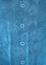
Jane Dunnewold sent a 2 yard cut of 10mm silk habotai dyed with Procion MX mixing blue - with tied resisted rings down the middle of the length. There were five circles on my cloth.
Before I received the cloth, I knew that I wanted to add dimension and holes to it. When I saw the cloth I felt I should keep some form of Jane's tied circles in it.
To begin, I retied the five circles with artificial sinew, wet the cloth and scrunched it into a plastic pan with the five points down. I poured hot thiorea dioxide water over the cloth - it didn't cover it - and microwaved it for several minutes until the fabric started to discharge. The discharging occurred only on the bottom of the pan where the cloth was sitting in the bath. I rinsed the fabric.
The circles are still tied - I again scrunched the wet fabric into the pan with the points sticking up and squirt bottle dyed the fabric with soda ash activated Procion MX dyes, microwaved for a few minutes till hot and steamy, waited until cool, then washed, took off the sinew and dried.
This was interesting, but kinda boring So.......
I tied up the five circles again and tied 18 more circles in a grid, and also tied some fan folds across the piece. I wet the cloth and scrunched it again in a pan, bathed it in the thiorea dioxide solution, microwaved - took a lot of color out. I rinsed and scrunced it back into the pan where I redyed with the mx dyes. Again the microwave - hot steamy - cool down - removed the sinew - washed and dried, much more interesting.
Next, I printed a couple of motifs with soda ash activated, sodium alginate thickened, MX dyes. One was my hand carved stamp. The feather was a commercial stamp. I spritzed a little soda ash water over the cloth, wrapped it in plastic and microwaved it till hot/steamy, then washed and dried.
The feather motif seemed too strong. I thought after washing, it would back down, haha, any MX color with fuchsia in it never backs down! With my circle stamp I applied a mixture of sparkly gold paints over the red feather. Better.
Now for the holes. I cut circles of freezer paper and arranged them on the fabric and ironed them on. I stabilized the holes by applying paint around the freezer paper circles. After the paint was dry, I cut out the circles. I ironed/pressed the painted parts to set the paint.
I decided to use some "hot fix" Angelina in the holes, hot fixed some and cut into circles to fit the holes. I cut some water soluable stabilizer to back the holes so I could sew the Angelina into the holes. I dabbed fabric glue stick on the stabilizer so it wouldn't move. I stabilized each hole in an embroidery hoop, and free motioned (using the sewing machine with the feed dogs in the down position) the Angelina into each hole. I soaked the fabric in warm water to remove the stabilizer - washed/dried.
Now for the dimension. As I worked on the main fabric, I was discharging and dyeing several other pieces of silk in the same colors as the main piece. I cut strips of this silk and used Misty Fuse to fuse them together, back to back. I free rotary cut triangles from the strips and then rounded two corners with scissors. If you pinch the rounded end together, the triangle stands up when sewn down. I used fabric glue stick to hold the dart; I sat at the table and glued and ironed each dart to set. The triangles were zigzagged on, around the tied circle shapes, at random.
The final process was to iron on foil shapes using Wonder Under. I then washed the cloth one more time to make the triangles floppy and to rough up the foil shapes.
Conclusion: At each stage of the process, except for the dyeing parts, I practiced the process on a different piece of silk. The holes with Angelina and free motion sewing on silk were problematic. The free motion sewing would draw up the fabric; the hoop was the answer, but I thought I'd have to take off the machine foot for each hole. I realized I could lift the foot over the hoop as the foot has a spring and the needle would go up a little more too. Foiling has always been beyond me, but I read about using it with fusible web so have made a sort of peace with it.


