 December 20, 2007
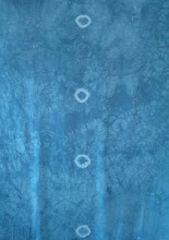
 Initial impression – EEEK – hate that mixing blue, and what will there be room to add, it looks pretty intense. Discharge paste is not my favorite medium but I think I will have to take some of the color out of it. Second, the round rubberbanded row of circles right down the center, the whole symmetry of it is a hard element for me.
Hanging it on the wall, maybe the blue is not so bad after all.
Now I want to work with soy wax since that’s the new boyfriend. I could use the circle patterns that I have been working with on the last few pieces of complex cloth. These have been what I call in my mind MEDITATION CLOTH because of the repetitions of the images, the simplest most seen most felt shape of all of us. The other idea would be to take the FERTILITY CLOTH imagery further, and look at that idea with new imagery.
I like focus and intense energy for problem solving. Its not my nature or my instinct to work too slowly on a challenge project like this, BUT I think I want to dye some more silk and put this same design on it so that I can play with it in series. A Series started by someone else is a really interesting idea.
PATTERN : “An ancient Egyptian craftsman manipulated nature by tracing the spots off a leopard’s skin and then reversing them to make a pattern of pale ivory patches set into black ebony. “ pg 254 The Art of Looking Sideways... Look at the next page for tessellation of a floor tile...then the squiggly pattern contrived by Ettore Sottsass from pictures of swarming bacteria BACTERIO (1970s)
It is a constant idea of mine, that behind the cotton wool (of daily reality) is hidden a pattern: that we – I mean all human beings – are connected with this: that the whole world is a work of art: that we are parts of the work of art – Virginia Wolfe ... Another idea – make some squiggles from that doodling program... Another idea – make a goddess like my quilts but just with art cloth techniques, layering, dyeing, a challenge for sure, how would that work. Think I can do that with something different. Figurative and layeredly. THAT would be a challenge. If I were to try this idea I would first discharge the general shape down the center of the fabric, less ¼ inch. Leaving the blue as the negative background space around it. This could be a challenge to put my art quilt and art cloth ideas together in yet another way - with dye, discharge, complex layering, paint and stitching... the heaviness of the quilted surface giving way to a figure more ephemeral? I wonder if it would still read as art cloth with such a strong narrative content to drive it?

NEXT VISIT: After looking at the cloth on the wall for a month. I don’t like the mixing blue color any better. I hate that there are so few light areas. I feel forced into discharge and I HATE to discharge silk. Whether discharge paste or thiox is safer than bleach is probably not the issue, but I don’t have a respirator that fits me well, would not use it enough to justify the expense, I have small narrow face and Ive never found one that fit well. This makes the challenge really tough, because the value of the piece is so dark already, Having to figure out how to go dark, darker OR use paint which changes the hand so in order to have lighter areas will be my issues to deal with.
Tried about 6 different overdyes today – black and reds seem best to me – I don’t really like the greens that come up with yellow. The browns from orange dyes seem really ugly to me. But – I know EVERYONE will do purples!! (See how weird it is to consider the “competition”) I want to make a different , diverse, piece that NO ONE BUT ME would think to do. How egotistical is that? Well, at least I want to make it more mine than anyone else's.
I think given my work of the past months, I will do soy wax and over paint. BUT I may try to boil out some of the color with rit color remover. Used outdoors, not around me. Or I will use paint and deal with the change of hand.
WHAT I DID TODAY. HELL, I LIKE TO PLAY AND IMPROVISE.

Started soy wax with circles and curly thingies all over, like the last couple of meditation pieces. After the paint experiment I decided to use paint as the light value and I screen printed the fertility ovum with what I thought was white, it was irredescent violet – wow...looks cool. This is printed OVER the soy wax so the wax witll resist some of the paint, THEN I painted wax over areas that I liked, the nucleus of the ovum, and some of the cell walls. This seemed to make a large band down the center. Dye painted with a fuschia down the middle, and as bars to make a cross emblem, then black dye on the rest of the edges. Also printed the edges with one of my scribble mark screens. Same paint.
Wrapped it up in plastic and tomorrow I plan to either dye print, or just wash it all out and see what I have so far. Probably will need to add more dye painting, and I will need to iron the irridescent violet areas. Hoping the hot wax helped to fix those, too. No fumes, just messy so far. Fun to play with the shapes and textures and patterns. I suspect we will still need some light contrast.
January 20, 2008
I like what’s happened, even though the colors as expected, are dark – there is a value shift with the paint even though some washed out. The distressed look of it I like, the way the wax served as a resist for the textile paint and the dye. It has the shape, subtly, of the kind of cross/shaman image. I would like to emphasize this with either paint, stitching or fused small bits – all of which need to be in the complementary yellow orange that will make the navy and violet-blue more interesting. Trying some options – the embroidery thread is good, but very time consuming and time is short right not. Still it may be the best answer. I am trying some puff paint samples and also need to test the fusing. One issue is to have the contrast of something really crisp and precise against all the distressed and organically messy kind of work. This is another fertility cloth, but seems like it's really old eggs.

January 22, 2008
Finished the challenge piece with Shiva paint sticks – glowing planets with little scratched crosses to make them more interesting-- and pigment pens – scribbling a layer of letters to the Universe. The name of this piece has gone several directions: Fertility Cloth #3 since it is related in imagery to those other two silk pieces, but I don’t have the sperm on it, just the ovum at a cellular view. Then it occurred to me that it also looked like the other end of the cosmic spectrum—the color and swirl is very nebula-ish in imagery, too. So the piece is called POWER OF TEN after the Ray and Charles Eames film of the same name, a piece that shows the similarity of structure and form from cellular to universal scale. One last step in 24 hours or so, iron the ink and shiva stick to heat set it all. And tear the selvedges? I need to look at the instructions, Oh and take a final set of photos for my records.
Conclusion: This piece in process was about playing with materials and with value. The technical problem: how to get depth and value range without discharge chemicals, since I don’t really want to use them. I think I have succeeded in a rather safe fashion – its an analogous palette which is quite easy to make work – I perhaps could have been more daring with color but nothing else I tried pleased me with the deep blue start.


No comments:
Post a Comment